Knowledge
Understanding PMS Colors: A Comprehensive Guide for Businesses and Designers
Nov
In the world of professional design and printing, PMS colors are the secret weapon for brands seeking unparalleled color consistency and precision. Whether you’re designing custom event displays or creating marketing materials, understanding PMS colors can transform your visual communication strategy.
What are PMS Colors?

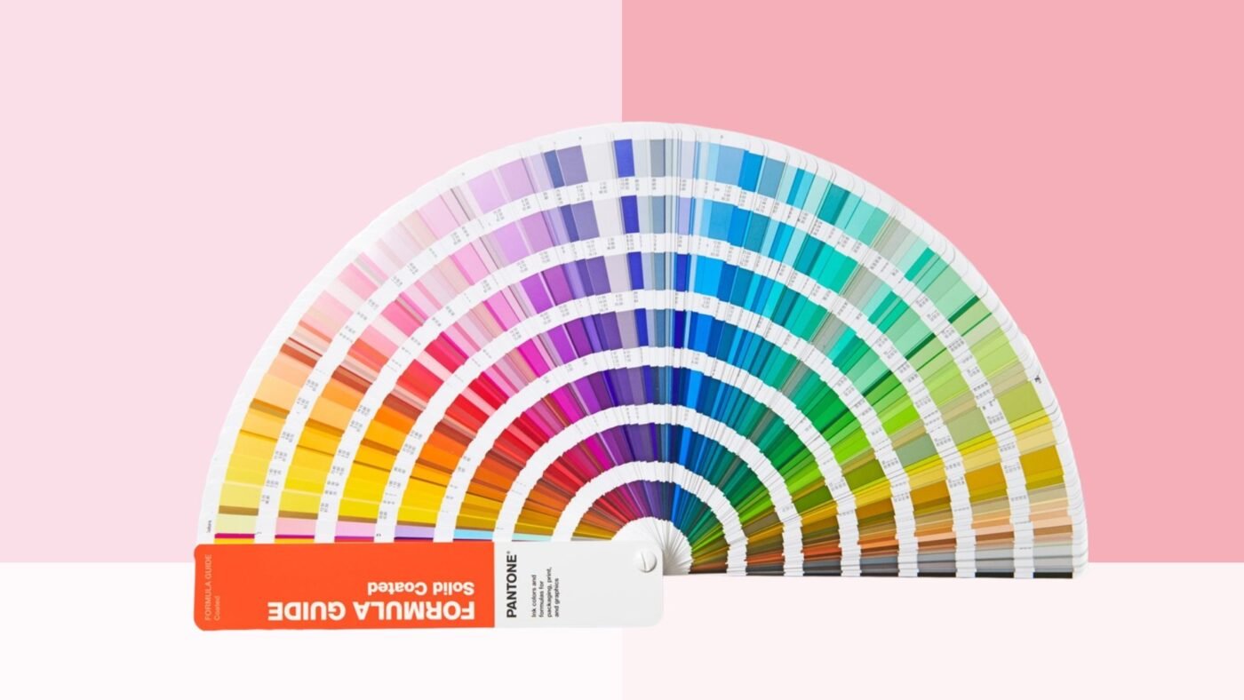
The Pantone Matching System (PMS) is a standardized color reproduction system that provides precise color communication across various industries. Unlike CMYK or RGB color models, PMS uses pre-mixed inks that ensure exact color reproduction every single time.
Key Differences from Other Color Systems
- CMYK: Mixes four colors to create various shades
- RGB: Used primarily for digital displays
- PMS: Pre-mixed, standardized ink colors for perfect matching
“PMS colors are like a universal language for color – speaking the same visual dialect across different mediums and materials.”
What is the significance of the “C”, “U”, and “M” letters in Pantone color numbers
In the Pantone Matching System (PMS), the letters “C,” “U,” and “M” in Pantone color numbers denote the type of paper or finish on which the color is intended to be printed:
- C (Coated): This indicates that the color is designed for coated paper, which has a glossy finish. Coated paper does not absorb ink as much as uncoated paper, resulting in more vibrant and saturated colors.
- U (Uncoated): This signifies that the color is meant for uncoated paper, which has a matte finish. Uncoated paper absorbs more ink, often leading to softer and less saturated colors compared to coated paper
- M (Matte): This letter is used to denote colors that are intended for matte finishes, providing a non-glossy appearance similar to uncoated but specifically for matte applications.
In the textile printing industry, we usually use Pantone Formula Guide Set | Coated & Uncoated .
The Critical Role of PMS Colors in Branding
Consistent branding is crucial, and PMS colors play a pivotal role in maintaining visual identity. By using standardized colors, businesses ensure that their logo, marketing materials, and products look identical across different platforms and printing techniques.
Branding Benefits
- Guaranteed color consistency
- Enhanced brand recognition
- Professional and cohesive visual presentation
PMS Colors in Printing: Technical Advantages
For businesses like StrongDisplay that specialize in custom canopy tents, PMS colors offer unparalleled printing precision. These standardized colors provide several critical advantages:
- Exact color reproduction
- Minimal color variation in large print runs
- High-quality output across different materials
Professional printing services can match PMS colors with extraordinary accuracy, ensuring your brand looks perfect every single time.
Practical PMS Color Applications
PMS colors transcend industries, finding applications in:
- Fashion design
- Automotive branding
- Product packaging
- Event marketing materials
Color Conversion Techniques
Converting PMS colors between different mediums requires specialized tools and resources. Here are some helpful conversion guides:
Professional designers use these conversion tools to ensure accurate translation between digital (RGB), print (CMYK), and standardized (PMS) color systems.
Pantone Color Trends and Their Business Impact
Each year, Pantone selects a Color of the Year that influences design trends across multiple industries. This selection reflects cultural movements, technological innovations, and aesthetic preferences.
External Color Trend Resources
Elevate Your Brand with Precise Color Management
Understanding and implementing PMS colors can dramatically enhance your brand’s visual communication. At StrongDisplay, we leverage cutting-edge color matching technologies to deliver exceptional custom printed products that stand out.
Ready to Transform Your Visual Branding?
Contact our expert design team today to discover how precise color management can elevate your event displays, marketing materials, and overall brand identity!Get A Free Color Consultation