Knowledge
Navigating the Nuances of PMS Color Matching: StrongDisplay’s Solution to Common Client Pain Points
Aug
Introduction: The Universal Language of Color – Pantone Matching System (PMS)
In the world of branding and visual communication, color consistency is paramount.
A brand’s identity is often inextricably linked to its specific colors, and any deviation can dilute recognition and impact. This is where the Pantone Matching System (PMS) plays a crucial role.
PMS is a standardized color reproduction system, a proprietary collection of colors used in a variety of industries, primarily printing, though sometimes in the manufacturing of colored paint, fabric, and plastic
By providing a universal language of color, PMS aims to ensure that colors appear the same across different materials and production processes.
However, despite its critical importance and widespread adoption, working with PMS colors can present a unique set of challenges for clients, leading to frustration and unexpected results.
At StrongDisplay, we understand these pain points and have developed comprehensive solutions to ensure your brand’s colors are reproduced with precision and consistency.
Common PMS Color Matching Pain Points and StrongDisplay’s Solutions
Pain Point 1: The Discrepancy Between PMS Code and Final Output
One of the most frequent frustrations clients encounter is color deviation. A client provides a specific PMS color code, expecting a precise match, only to find that the final printed sample or product deviates from their anticipation.
This can be due to a multitude of factors, including differences in printing technology, substrate variations (e.g., fabric vs. rigid plastic), ink absorption rates, and even environmental conditions during printing.
Furthermore, different printing processes like digital printing, heat transfer printing, and screen printing can yield distinct color renditions. The perceived color can also be influenced by lighting conditions under which the sample is viewed.
StrongDisplay’s Solution: At StrongDisplay, we mitigate this pain point through a multi-faceted approach. We utilize state-of-the-art printing technology, including advanced digital and screen printing methods, which are meticulously calibrated to achieve the closest possible PMS match.
Our process begins with a thorough understanding of the client’s desired color and the intended application. We conduct rigorous pre-press checks and employ experienced color technicians who understand the nuances of color reproduction across various materials.
Furthermore, we offer detailed explanations of how different substrates and printing methods can affect the final color, setting realistic expectations from the outset.
Our commitment to using eco-friendly inks that offer superior color retention also contributes to consistent and vibrant results.
Pain Point 2: Client Unfamiliarity with PMS Color Codes
Many clients, while having a clear vision for their brand colors, may not be intimately familiar with the intricacies of the PMS system. They might provide a general color description or a CMYK/RGB value, assuming it directly translates to a PMS equivalent.
This lack of understanding can lead to miscommunication and dissatisfaction when the final product doesn’t align with their initial, often unarticulated, expectations of a PMS color.
StrongDisplay’s Solution: We bridge this knowledge gap through proactive client education and consultation. Our team works closely with clients to understand their color preferences and then guides them through the PMS selection process.
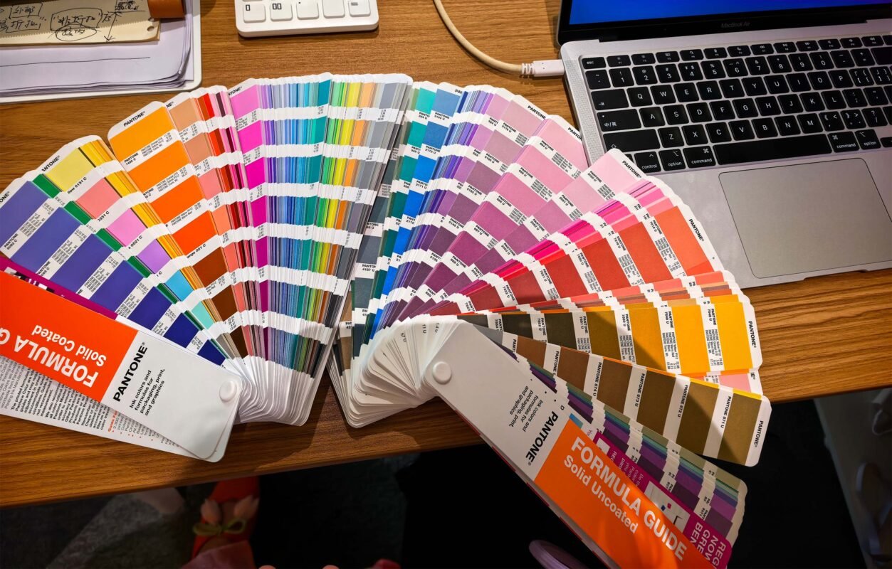
We provide visual aids, such as physical PMS swatch books, to help clients accurately identify and confirm their desired colors. We explain the difference between spot colors (PMS) and process colors (CMYK), and how digital (RGB) colors are rendered.
By offering clear, concise explanations and visual references, we empower clients to make informed decisions about their color choices, ensuring that the PMS codes selected truly represent their brand vision.
Pain Point 3: Absence of a Robust Color Confirmation Process
Without a clear and standardized color confirmation process, clients often find themselves in a reactive position, discovering color discrepancies only after production has begun or even after receiving the final product.
This can lead to costly re-runs, delays, and significant frustration. A lack of formal approval steps for color proofs can leave both the client and the manufacturer vulnerable to misunderstandings and unmet expectations.
StrongDisplay’s Solution: StrongDisplay implements a rigorous, multi-step color confirmation process designed to ensure client approval at every critical juncture.
Before mass production, we provide detailed digital proofs and, whenever feasible, physical samples or swatches for client review and approval. This allows clients to visually confirm the color accuracy under their preferred viewing conditions.
We clearly outline the approval stages, ensuring that no production proceeds without explicit client sign-off on color.
This proactive approach minimizes the risk of color-related issues and ensures that the final product meets the client’s exact specifications, fostering trust and transparency throughout the production cycle.
Pain Point 4: Lack of Awareness Regarding Color Deviation Across Display Devices
In today’s digital age, clients often review designs and approve colors on various display devices – laptops, tablets, and smartphones. However, each device renders colors differently due to varying screen calibrations, display technologies, and ambient lighting conditions.
What looks perfect on one screen might appear significantly different on another, leading to a disconnect between the client’s digital perception and the physical printed output.
Clients may not be aware of these inherent display discrepancies, leading to confusion and disappointment when the printed product doesn’t match their on-screen expectation.
StrongDisplay’s Solution: StrongDisplay educates clients about the critical differences between on-screen color representation (RGB) and printed color (PMS/CMYK).
We emphasize that digital proofs are for layout and content approval, while physical color swatches or printed samples are essential for accurate color assessment. We advise clients to view physical proofs under standardized lighting conditions to minimize external influences.
Our sales and design teams proactively discuss potential display-related color shifts and set realistic expectations, guiding clients to understand that a digital representation is an approximation, and the true color is best judged on a physical medium.
This transparency helps manage expectations and prevents surprises, ensuring clients understand the limitations and best practices for color review.
Pain Point 5: Absence of Defined Color Tolerance for Custom Printing
Clients often expect absolute color consistency, not realizing that some degree of variation is inherent in any printing process, especially in custom manufacturing.
Without a clear understanding or pre-defined tolerance range for color deviation, clients can become overly critical of minor shifts, leading to disputes and rework.
This lack of transparency regarding acceptable color variations can create unrealistic expectations and strain client-manufacturer relationships.
StrongDisplay’s Solution: StrongDisplay proactively addresses this by establishing and communicating clear color tolerance guidelines for all custom printing projects.
We work with clients to define acceptable color variation ranges upfront, based on industry standards and the specific requirements of their project.
This might involve providing visual examples of acceptable and unacceptable color shifts or referencing Delta E (ΔE) values for highly color-sensitive applications.
By setting these expectations early and transparently, we ensure that clients understand the natural variations that can occur in printing.
This collaborative approach fosters a shared understanding of quality, minimizes subjective interpretations of color accuracy, and ensures that both parties are aligned on what constitutes a successful color match.
Our commitment to quality control and continuous process improvement means we strive to keep variations within these agreed-upon tolerances, delivering consistent results that meet or exceed client expectations.
Conclusion: StrongDisplay – Your Partner in Perfect Color
Achieving perfect color consistency in custom printing, especially with PMS colors, can be a complex endeavor. However, by understanding the common pain points and implementing robust solutions, the process can be streamlined and made far more predictable.
At StrongDisplay, we are committed to being more than just a manufacturer; we are your dedicated partner in navigating the nuances of color matching.
Through our advanced printing technology, client education, rigorous confirmation processes, transparent communication about display variations, and clear tolerance guidelines, we empower our clients to achieve their desired brand colors with confidence and precision.
Choose StrongDisplay for vibrant, accurate, and consistent color reproduction that truly brings your brand vision to life.